


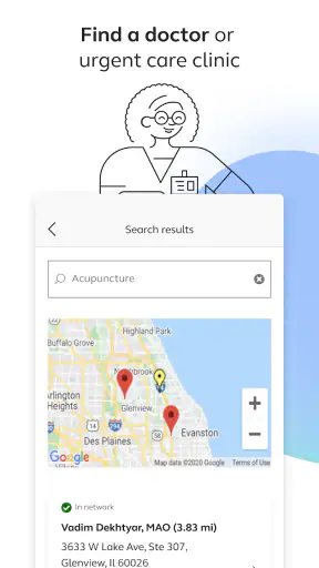
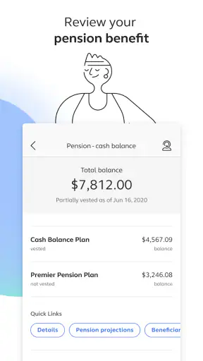
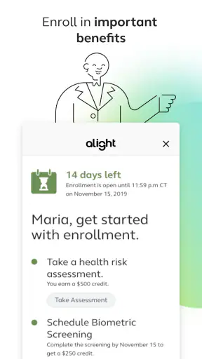
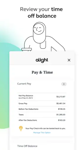
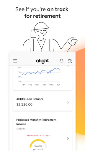
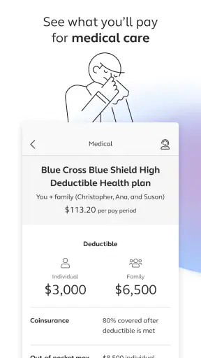
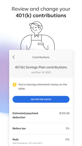
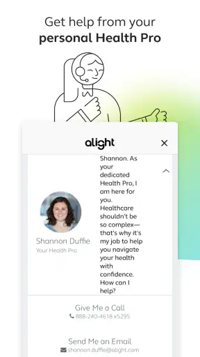
When I first opened Alight Mobile, I approached it less like a general-purpose business app and more like a pocket doorway into workplace benefits. That distinction matters. This is not the kind of app I would install for project management, invoicing, or team chat. Its purpose is much narrower and more practical: helping employees reach benefit-related information while they are away from a desktop.
That focus makes the app easy to understand, but it also sets a clear boundary around its usefulness. If your employer uses Alight Solutions, LLC for benefits administration, having the service on a phone can save time when you need to check something during an ordinary day. If your workplace uses a different provider, the app will not replace that provider’s portal. In my experience, the value depends heavily on whether your benefits are connected to the Alight system in the first place.
Alight Mobile is a free business app for Everyone, and it has passed the one-million-install mark. Its average rating sits at 3.4 from roughly forty-four thousand ratings, with about three thousand six hundred written reviews. I read that combination as a useful warning: plenty of people find a reason to keep it, but the experience is not consistently smooth for everyone.
From a benefits question to a useful answer
The starting point is usually a small problem
The most realistic reason to open this app is not curiosity. It is a moment when I need an answer that is connected to my employment benefits. Perhaps I am trying to understand what is available, locate information before making a decision, or check details while I am not sitting at my work computer. The app is most helpful when the question is specific and time-sensitive enough that searching through old emails or asking a colleague feels inefficient.
That starting condition also explains why the app can feel more valuable than its simple store summary suggests. Benefits information is often scattered across enrollment messages, employer intranets, insurance documents, and separate provider websites. A mobile benefits hub can reduce that mental switching, at least when the relevant information is properly connected to the user’s account.
I would not expect it to make complicated benefits choices effortless. A phone screen is still a phone screen, and benefit language can be dense even when the interface is clear. What the app can do well is shorten the path from “I need to check this” to “I have found the relevant place to continue.” That is a modest goal, but it is a useful one.
Getting ready before relying on it
Before treating Alight Mobile as my only benefits reference, I would make sure I know which workplace account it is meant to serve. This is an important practical step because the app is not a universal benefits directory. It is tied to an employer’s setup, so the correct access route depends on that relationship rather than simply on downloading the application.
I would also keep my employer’s enrollment information nearby during the first setup. If the app asks me to identify an organization or complete account access steps, having those details available prevents the first session from turning into a search through old messages. This is one of the less obvious habits that makes the experience less frustrating: the app may be on my phone, but the information needed to connect it to my workplace may still be elsewhere.
The current version is 7.2.0 and requires iOS or Android 12 or newer. That requirement is worth checking before planning around the app, especially if I use an older phone that still handles everything else I need. A benefits tool is not urgent enough to justify replacing a device, so compatibility should be settled before I depend on it for an enrollment task.
Moving through the app step by step
Once access is available, I would use the app with a question in mind rather than browsing randomly. That approach is more efficient because benefits portals can contain several areas that look relevant at first glance. Starting with a clear goal—such as reviewing a benefit area, finding a document, or continuing toward a service—helps me notice whether the app is actually reducing effort.
The first useful test is whether the app gets me to the right benefits area without making me repeat the same search I would have performed in a browser. If it does, the mobile format earns its place. If I still need to move through several unrelated pages or remember which external service handles the next step, the app becomes more of a signpost than a complete solution.
That is not necessarily a failure. Benefits administration often involves several organizations and handoffs. A mobile app may be doing its job by organizing the starting point, even if the final transaction or detailed information lives somewhere else. My advice is to judge it by the whole journey: how quickly it helps me identify the right destination, not only by whether every task happens inside one screen.
Another practical tip is to pause before making a choice based on a short label. Benefit names can sound similar while referring to different kinds of coverage or account information. I would open the supporting details and check the context rather than assuming the first matching option is the correct one. On a small display, that extra moment is safer than having to undo a decision later.
The handoffs are where expectations matter
The most important part of the workflow is often the handoff. Alight Mobile may help me reach the right benefit information, but the next stage can involve an employer-specific page, a document, or another service connected to the benefit itself. From a user’s perspective, that can feel like leaving the app, even when it is a normal part of how workplace benefits are administered.
I find it helpful to treat the app as a coordinator rather than assuming it is the final destination for every action. That mindset prevents a common disappointment: expecting one application to replace every insurer, account provider, or employer system involved in a benefits program. When the app directs me elsewhere, I can ask a more useful question—did it take me to the correct next step, and did it preserve enough context for me to continue?
Handoffs also create a practical record-keeping issue. If I begin a task on my phone and finish it in another service, I should note what I completed and what remains. This is especially useful when I am comparing options or preparing for an enrollment deadline. A quick personal note can prevent me from reopening the app later and wondering whether I only viewed information or actually finished the action.
For a real-world example, imagine I am away from my desk and need to review a workplace benefit before speaking with a family member. I open the app, locate the relevant area, read the available information, and then follow the next step if the decision requires a separate page or provider. The outcome is not necessarily a dramatic one-click purchase. The real gain is that I have converted a vague question into a clear next action without waiting to reach a computer.
What a successful result looks like
A good result with Alight Mobile is clarity. I want to finish knowing which benefit area applies, what information I still need, and where I should go next if the app cannot complete the task itself. That may sound less impressive than a fully integrated transaction, but it reflects how benefits work in real life: the hardest part is often finding the correct path.
The app can also be useful for quick checks during moments that do not fit a normal office routine. I might be traveling, waiting in a clinic, or discussing household planning away from my laptop. In those situations, a phone-based entry point is more convenient than remembering an employer portal address or carrying printed paperwork.
Still, I would not use a mobile interface as the only place for careful comparison. If I am making a major benefits decision, I prefer a larger screen for reading full explanations and keeping multiple details visible. Alight Mobile is better at getting me into the information flow than at replacing deliberate research. That is a key trade-off: convenience improves access, while the limited screen can make deep review less comfortable.
One of the strongest ways to use it is as a preparation tool. I can use the app to identify the relevant benefit and gather the basic direction, then move to a larger screen when I need to compare documents or think through a complicated choice. This two-stage workflow is more realistic than expecting the phone to handle every part of the decision equally well.
Where the workflow breaks down
The first possible break is access. If my employer has not connected the relevant benefits to Alight, downloading the app will not solve the problem. That is why I would confirm the workplace relationship before spending time troubleshooting the application itself. A different employer portal may be the better option when the benefits arrangement does not use Alight.
The second break is account friction. Login or verification problems are particularly annoying in a benefits app because I usually open it with a specific need, not to pass time. A delayed session can send me back to email searches, desktop browsers, or human support. The app’s moderate rating suggests that convenience is not universal, so I would keep an alternative way to reach my benefits information until I know the mobile workflow is dependable for my account.
The third break is incomplete continuity between the app and connected services. If I have to repeat information, reorient myself, or figure out which page handles the next stage, the promise of a single mobile starting point becomes weaker. This is where a traditional employer website can sometimes be preferable: a larger layout may make the relationships between sections easier to understand, even if it is less convenient to open.
There is also a human limitation that no interface completely removes. Benefits questions can be personal and complicated. If I need an explanation rather than a location, I would not assume that tapping through the app is enough. I may need to read the underlying material carefully or contact the appropriate benefits support channel. The app helps with access, but it should not be mistaken for personal advice.
Who will appreciate it most
Alight Mobile is a sensible choice for employees whose workplace benefits are administered through Alight Solutions, LLC and who regularly need mobile access. It is particularly useful for people who travel, work away from a desk, share household decisions, or simply prefer handling short administrative tasks from a phone. The free price removes the main financial barrier, so the real question is whether the connected employer experience is useful.
I also think it suits users who are comfortable with a guided workflow that may include handoffs. If I understand that the app can be the front door rather than the entire building, I am more likely to appreciate what it does. It can organize the first step, help me find the right area, and make benefits information available in situations where a desktop is inconvenient.
I would be more cautious if I rarely use workplace benefits online, if my employer provides a clearer dedicated portal, or if I need to perform complex comparisons frequently. In those cases, the ordinary browser experience on a computer may be easier to read and manage. Someone whose employer does not use Alight should skip this app altogether and use the official system connected to their workplace instead.
How it compares with the usual alternatives
Compared with an employer intranet, Alight Mobile is more convenient when I am away from a computer and already know I need benefits information. An intranet may contain broader workplace news and policies, but it can take more effort to navigate on a phone. The app’s advantage is focus: it is built around the benefits journey rather than the entire employee website.
Compared with a mobile browser, the app offers a more direct starting point once my account is working. A browser remains more flexible, especially when I need to open several documents, compare pages, or switch between unrelated workplace resources. I see the app and browser as complementary rather than competing replacements. The app is the quicker doorway; the browser can be the better workspace.
Compared with separate provider apps, Alight Mobile has the advantage of beginning from the benefits relationship rather than from one narrow service. A provider-specific app may be better for detailed use of that particular service, while Alight is more useful when I am still figuring out which benefit or destination applies. The trade-off is that a central hub may not offer the same depth as a specialist app at the final stage.
My practical verdict after using the workflow
Alight Mobile is a focused business tool that makes the most sense when I treat it as a mobile benefits entry point. Developed by Alight Solutions, LLC and released in October 2020, it has grown into a widely installed option, but its average rating of 3.4 shows that reach should not be confused with a flawless experience. The app earns credit for making workplace benefits more accessible, while its account dependence and possible handoffs keep it from being universally convenient.
My recommendation is conditional but positive: install it if your employer uses Alight and you often need to check benefits away from a desktop. Before an important deadline, test the complete route from sign-in to the intended result instead of assuming that downloading the app is enough. Keep your employer information available, identify whether the task finishes inside the app or elsewhere, and use a larger screen when the decision involves dense details.
For quick access and everyday orientation, it can be genuinely helpful. For complicated research, difficult account problems, or workplaces outside the Alight system, another route will be better. In the end, the app’s strength is not that it transforms benefits administration; it is that it can remove one layer of distance between me and information I already have a reason to need.


